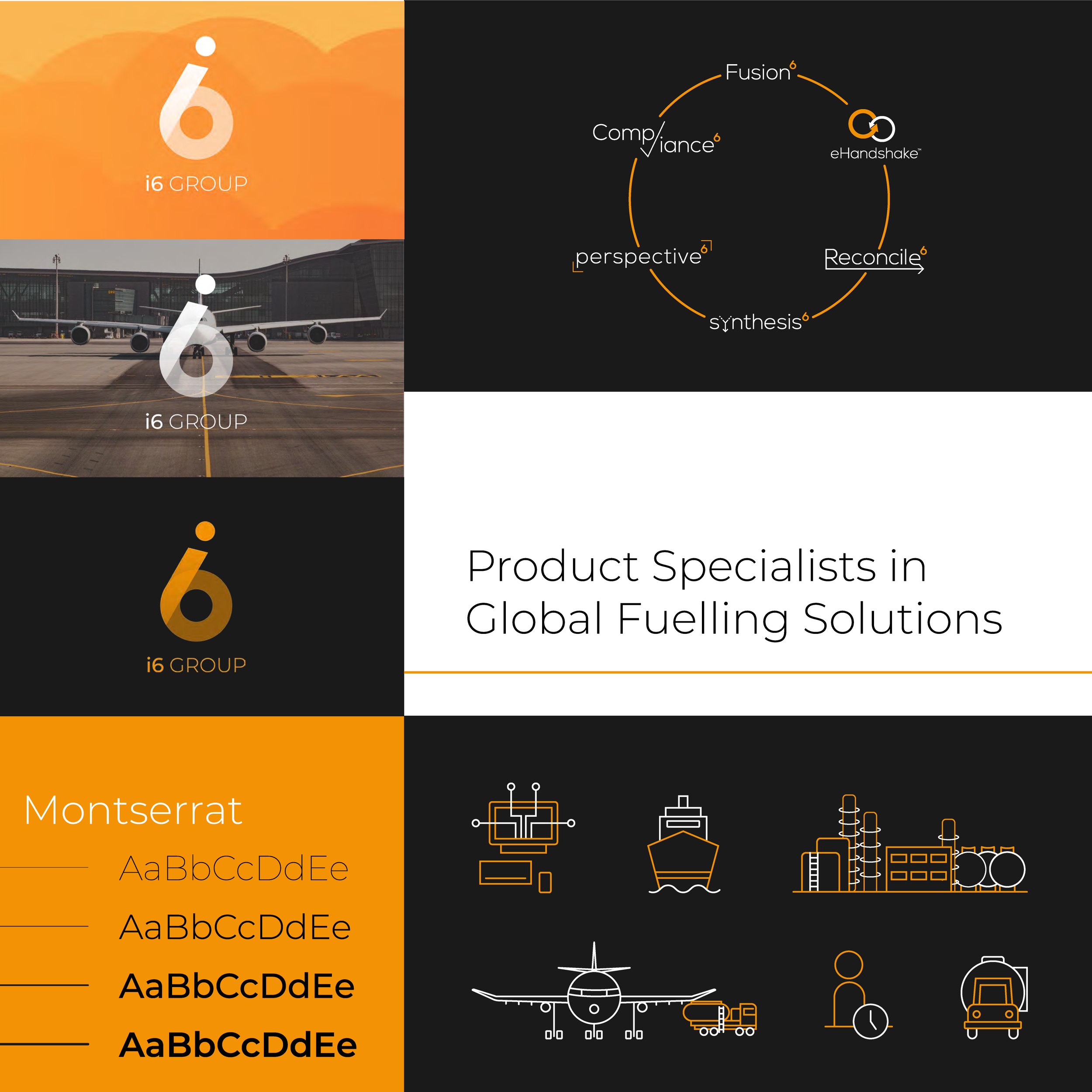
i6 Group
Branding | Corporate | Web Design
i6 prides itself on being the market leader and disrupter of the fuel management industry. This attitude was evoked through the design through bold and bright colours, strong linework, and bespoke iconography for a playful touch of. It gave the company a professional edge, levelling up their position within the industry.
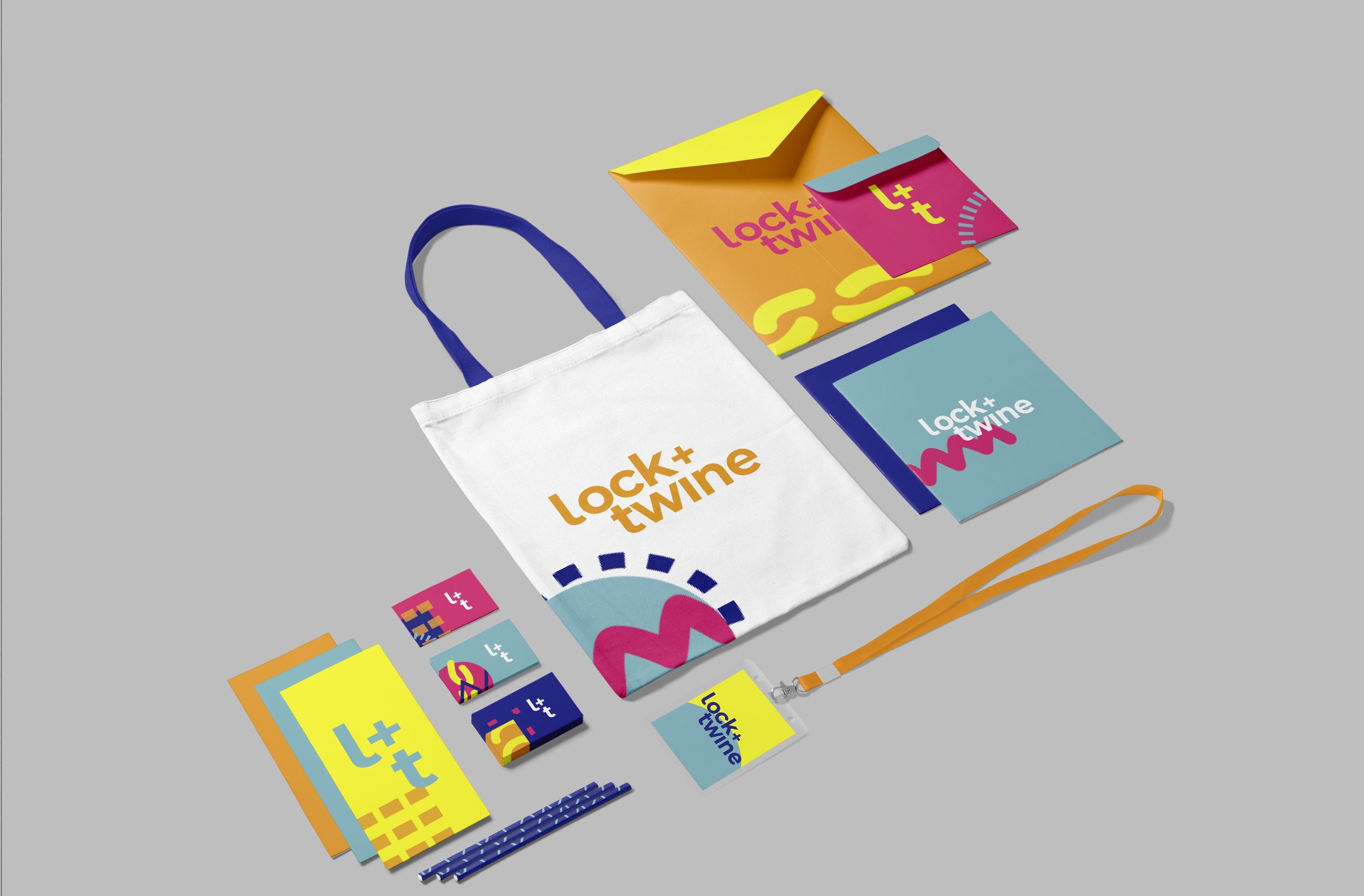
Lock & Twine is the space for those serious about arts and crafts; based on the concept of skill sharing, the space is community focused with member led workshop and events. The logo and brand elements were a result of taking mixed mediums such as knitting, sewing, painting, and photography, and creating representative graphics.
Lock + Twine
Branding | Visual Identity

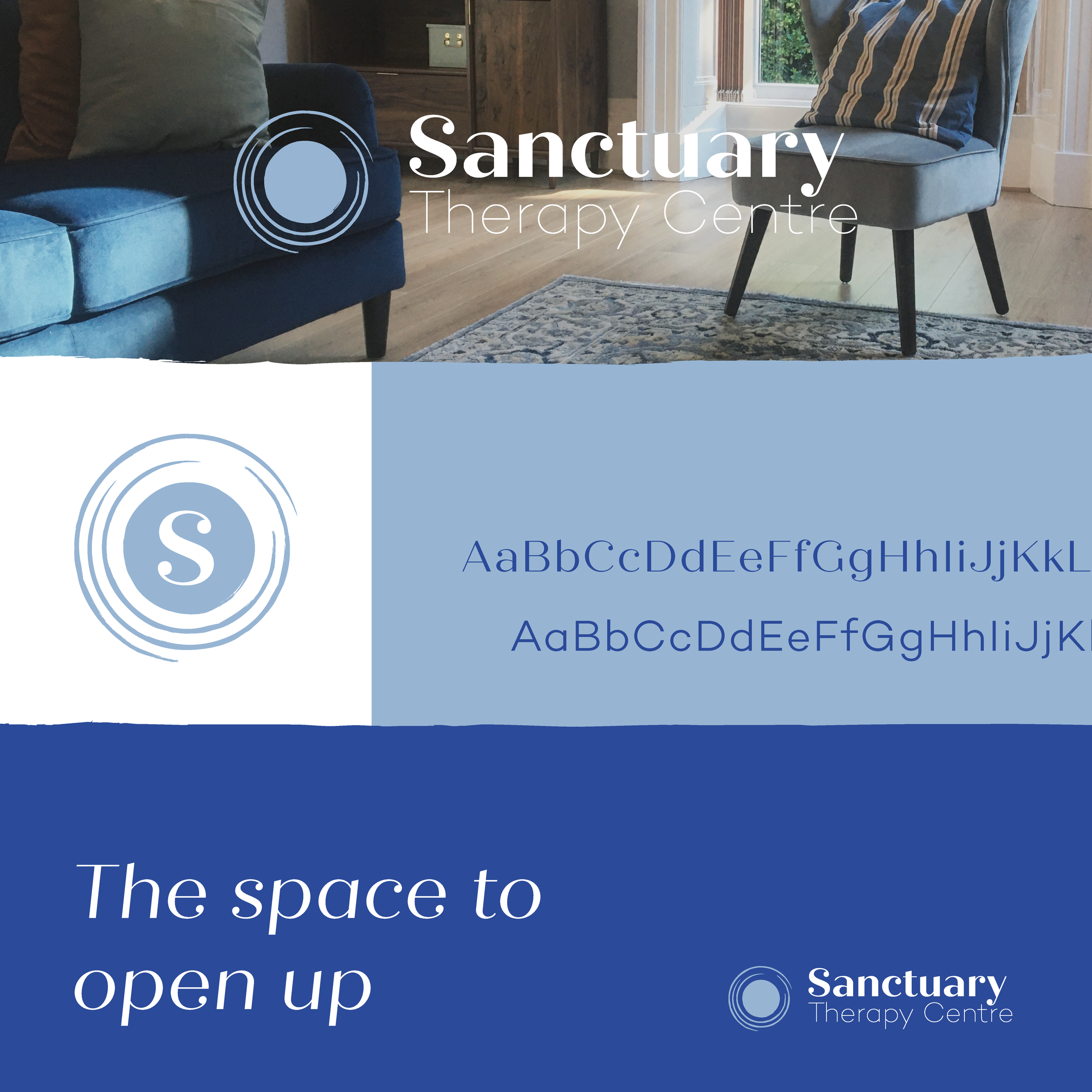
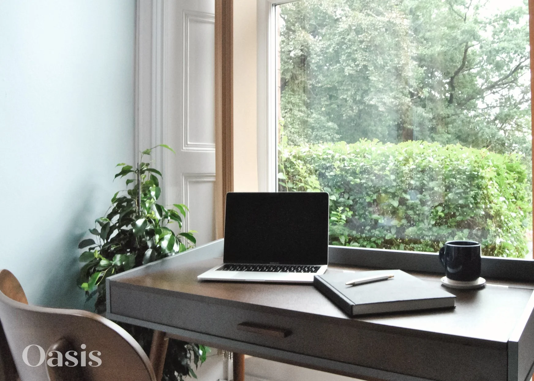
Sanctuary Therapy Centre
Branding | Interiors
Creating a visual identity for a therapy centre involved designing a pratical space for therapists to hire out and where clients can feel safe and comfortable.
I used a cool, neutral colour palette to create a sense of calm, with a circular logo to suggest both opening up and the comfort of feeling enclosed and supported. Textured edges were used as a branding element to provide vulnerability and emotion.